
Claude: Designing with AI
Sep 12, 2026
I’ve been using AI tools — Claude, Copilot, Cursor, Kiro — for a few years to enhance my development output. I recently decided to test out how effectively I could guide AI toward a production-ready design by prompting Claude.
An eCommerce site (Women Wavemakers) I built a few years ago was looking a bit outdated. I created the site as a learning project for React and I hadn’t touched much of the code lately. I knew there were not only performance and accessibility enhancements that needed to be addressed, but the overall user experience needed to be improved upon.
The Ask
The previous design used a combination of sharp and rounded edges. Besides the homepage, all internal pages were much more minimalist with a lot of white space.
Below, you can see the homepage and FAQ page to get a sense of the original aesthetic.

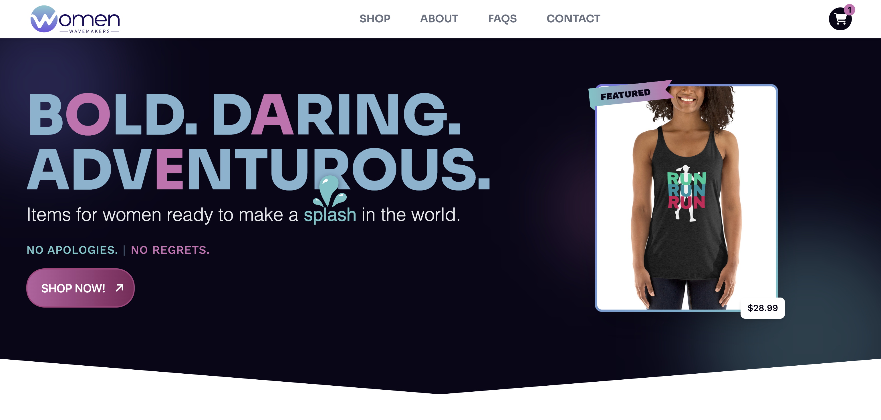
For the new version, I asked Claude to start with some general design enhancements — keep the current color scheme, but make the general look and feel more modern and interactive.
The Result
Claude provided one playful design that leaned a bit too much into 1990s Lisa Frank and Save By The Bell style. The other, however, was much more aligned with my current style goals.

It was a design I could work with, but not take to production.
This, I would argue, is where human input and expertise is required. As a developer, I understand how performance impacts whether users leave or stay on a site. I review site quality by evaluating the responsiveness of my code and how accessible it is.
Similarly, as a designer, I look for contrast, in typography and color, as well as alignment and spacing. But I also focus on hierarchy to guide the user from the most important to least important info on the page, whether interactions enhance or distract from the experience, and consistency of elements like buttons, card tiles and heros to reduce confusion.
An Iterative Process
Much like an actual design, I learned that while Claude can certainly create a relatively quick design, it requires a lot of refinement. Below are 6 items I was very intentional about while using Claude as an AI assistant:
- Button interactions and display — I wanted a specific hover effect for how the color gradient and the arrow button animated on mouseover. While I could visualize the animation in my head, describing that interaction took a bit more effort and even some manual code adjustments on my end. I also wanted the button prominent on both desktop and mobile to stand out as a call to action to urge users to navigate to the Shop page.
- Form inputs — I specifically added some fun placeholder text along with explicit labels above input fields. Placeholder text without labels disappears once the user clicks into an input field, which leads to a poor user experience. In addition, I added the word ‘required’ for fields that were mandatory. In one design option, Claude completely removed the word ‘required’ and opted for the asterisk-only version. While an asterisk may be implied in many designs as indicating a required field, it is not accessible for screen readers.
- Consistent Heroes — while the Homepage and Shop pages have a unique layout, I wanted to ensure that other pages (About, FAQs, Contact) maintained a consistent look and feel. Keeping headers and alignment on these pages is important for reducing the cognitive load on users when pages feel similar and part of a cohesive whole.
- Loading Skeletons — rather than using a spinning icon, like in my original design, I chose to add loading skeletons. This gives the user a signal that the page content is not only loading, but it also clues them into how content on the page will be displayed so it’s less of a jarring interaction when the content does load. Again, a small, but important enhancement.
- Accordion carets — as I was making updates, a timely post crossed my feed from UI expert Vitaly Friedman about the most effective icons in Accordions. (Read the article: Accordion Icons: Which Ones Work Best?). Both my old and new design initial used +/- icons to show an expanded/collapsed state. However, after reading about the effectiveness of carets, I switched from +/- icons to carets based on this research.
- Performance — the old site had a loading spinner, but it had stalled because of how API tokens were setup. I asked Claude to review the code so it was more performant on initial load and that it used caching for the Shop items rather than re-fetching data for each page. It added cache-control headers to Netlify as well as session storage with a TTL of 10 minutes. Lighthouse scores show: 98 Performance, 92 Accessibility and 100 SEO — strong ratings on each category.
The Verdict
Claude is a powerful tool and it’s an excellent starting point for designs. But it doesn’t solve for judgment and experience. It was much faster than what I could have designed on my own, but it wasn’t perfect. I firmly believe that creative processes are iterative. I may have an initial idea of what I want, but the finished product is often vastly different.
Even during the process, I decided to add a ‘Favorites’ button to icons followed by separate page for users to review their most liked items. It’s a common pattern in many eCommerce sites and it saves users from needing to sift through items each time they visit the site.
Claude has learned how to create relatively effective outputs based on what already exists in the world. But research about best practices are ongoing and users will always be unpredictable. It’s the knowledge that humans gain over time that ensures a visual experience isn’t just pretty, but actually functional and easy to understand.
What's Next?
I'd like to look into setting up a more formal design system, specifically for the typography and colors. This will help keep future updates consistent and easily referenced.
And, I’ll continue to use AI tools, but will also bring my own judgment and knowledge.
Feel free to check out the new site at www.womenwavemakers.com and reach out with any feedback!